There's magic to walking into a room and feeling at ease. Sometimes, it's the furniture. Sometimes, it's the lighting. But more often than not, the color on the walls sets the mood, whether you notice it consciously or not. When it comes to choosing paint colors for your home interior, it's more than just picking what looks good on a swatch. It's about how it feels, how it reflects light, and how it weaves your personality into the space. And let's be honest—standing in front of a wall of paint chips with names like Morning Fog" and "Antique Rose" can be a little overwhelming. But don't worry, you're not alone. With a little direction (and maybe a few secrets from the pros), you'll be well on your way to creating a space that feels just right.
Start with What You Already Love
Before we get into color theory and mood boards, take a look around your home. What colors are showing up again and again in your decor? Maybe your favorite rug has a deep navy thread, or your throw pillows lean into warm rusts and golds. Your existing furniture, artwork, and textiles can give you a solid starting point. As you prepare to begin the work, think of adding a new coat of paint as curating your existing style, not starting from scratch. Find colors that complement what you already own and love. That way, your paint won't feel like a stranger crashing the party but rather a natural extension of your style.
Think in Terms of Mood, Not Just Looks
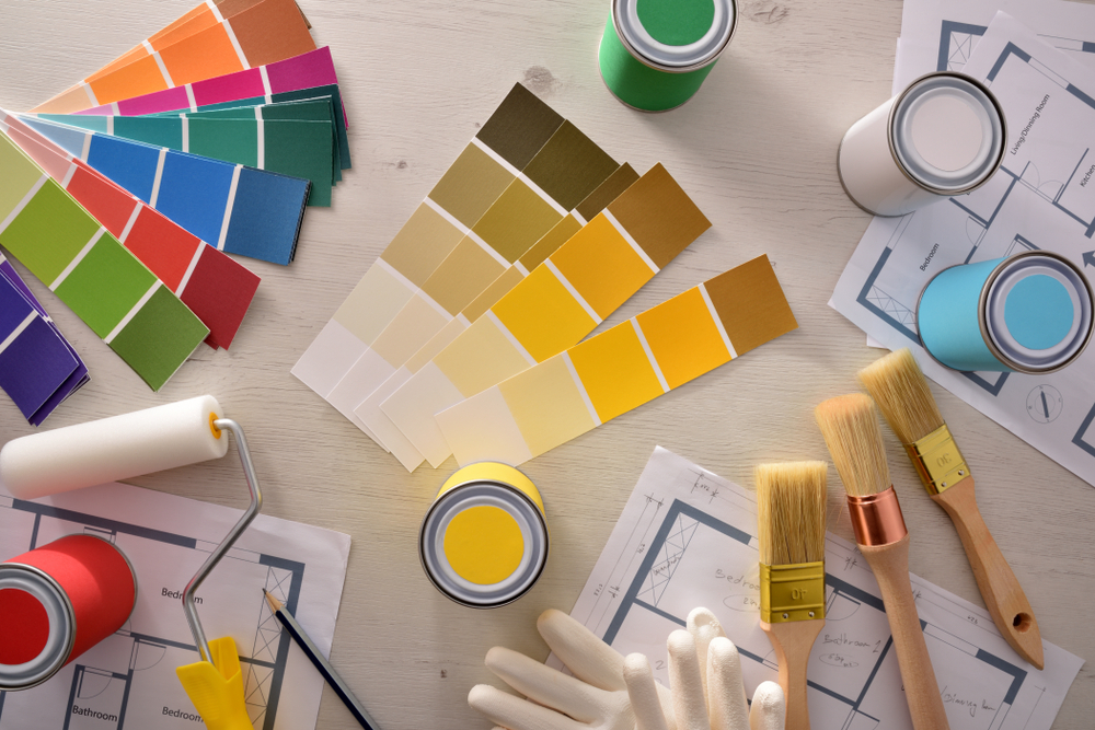
Color is emotional. That's not woo-woo—there's science behind it. Blues tend to be calming and clean, making them ideal for bedrooms and bathrooms. Greens feel refreshing and grounding and are great for living rooms. They also work beautifully in the kitchen. For example, painting kitchen cabinets this color can add a fresh and inviting touch to the room. Yellows? Bright and energetic, perfect for a sunroom or breakfast nook. But here's the thing: the same color can look dramatically different depending on the lighting. A soft gray might look cool and modern in a north-facing room, but it takes on a greenish tint under warm bulbs. That's why paint samples exist. When choosing paint colors, it helps to apply swatches and see how they shift with the light. What looks like the perfect beige in the morning could feel dull and lifeless by nightfall.
Don't Sleep on Neutrals—They're More Powerful Than You Think
It's tempting to go bold, and sometimes you should. But neutral doesn't have to mean boring. Warm taupes, soft greiges, creamy whites—they create a versatile backdrop that lets your personality shine through in the accents. Plus, they play well with light, helping smaller rooms feel bigger and brighter. Neutrals are also your best friend if you plan on selling your home shortly. A fresh coat of a subtle, inviting shade can make a huge difference in how a space is perceived. And hey, if you want to sneak in some drama, do it on a single wall or in a powder room—places that can afford a little edge.
Embrace the Flow of Your Home
Here's something a lot of people forget: your home isn't a collection of isolated boxes. It's a connected space. The color you choose for your entryway will inevitably peek into your living room. The dining room might open into the kitchen. That's why your palette should feel cohesive, even if each room has its own vibe. A good trick? Stick to a few base tones and vary the shades. Maybe it's a smoky blue in the den, a misty version of that same blue in the hallway, and an off-white with a blue undertone in the bedroom. It'll feel intentional without being too matchy-matchy. And while we're on the topic of transitions, don't forget about trim, ceilings, and doors. A crisp white trim can make colors pop, while a soft off-white on the ceiling can warm up the entire space.
When in Doubt, Look to Nature
If you're stuck, look outside. Seriously. Nature has a way of combining colors that just works. Think terracotta and olive green, sky blue and sandy beige, charcoal and pine. These palettes feel grounded and familiar, which is probably why they're trending hard in interior design right now. There's a calmness in natural hues that just feels good to come home to. And that's the whole point, right?
The Lighting Game-Changer
We touched on it earlier, but it bears repeating—lighting changes everything. Natural light, warm light, cool LEDs... they all affect how paint appears. So if you're working in a basement office with no windows, that dreamy pale lavender might suddenly look icy and sterile. Before locking in your final color, test it under the lighting you use. Not just daylight. Turn on the lamps. Fire up the overheads. You might be surprised at what you see. This is also where sheen comes in. Matte finishes hide imperfections and give a velvety look, while eggshell or satin reflect a little more light and are easier to clean. High-gloss? Save that for doors or dramatic accents.
Bringing It All Together
So, where does that leave us? Somewhere between gut feeling and practical decision-making. Choosing paint colors for your home interior is both an art and a bit of science. It's about how you want your home to feel, how light plays on your walls, and how everything ties together into something uniquely yours. Don't be afraid to take your time. Gather samples. Tape them up. Walk by them for a few days. You're not just painting walls—you're setting a tone for everyday life.
Final Touches with the Right People by Your Side
Truth is, you could pick the perfect color—and still be disappointed if the finish is uneven or the edges are messy. That's where seasoned professionals come in. Serving Bedford, Dartmouth, Halifax, and nearby Nova Scotia communities, MG House Painting is your trusted residential interior painter, delivering expert painting services marked by skill, attention to detail, and extensive experience. So if you're ready to start choosing paint colors for your home interior and want them to look just as good on your walls as they do in your mind, reach out. Contact us today and let's bring those colors to life with a flawless finish you'll love for years to come.